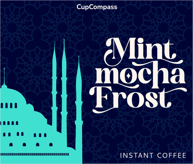
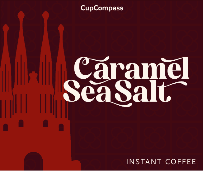
I created the complete brand identity and packaging system for Cup Compass, turning destination-inspired roasts into collectible visual experiences. The scope spanned end-to-end design, translating city-specific architecture into modular packaging patterns, luxury gift sets, and dynamic launch animations for digital platforms.
Role
Lead Brand Designer & Motion Director
Discipline
Strategic Branding __ Packaging Design __ Custom Typography __ Motion & Video Campaign __
Deliverables
Full Brand Identity System | Packaging Lineup Brand Launch Video | Social Media Posts
Software Used
Adobe Illustrator (Graphics) Adobe After Effects (Motion) Adobe Photoshop (Mockups) Autodesk Maya (3D)

Brand Strategy and Identity | Brand Launch Campaign
PROBLEM STATEMENT The specialty coffee market is saturated with minimal, monochrome branding that all blends together. CupCompass needed to launch an internationally inspired coffee line that transformed routine coffee breaks into cultural journeys. The challenge was to build a brand identity system flexible enough to represent distinctly different global cities: Kyoto, Istanbul, Mexico City, and Barcelona, while maintaining a unified, premium visual presence on retail shelves and digital channels, establishing strong visual associations for the brand.

MY ROLE As a Strategic Brand Identity and Motion Designer, my role included developing the brand's complete visual identity, creating the stylescape, designing the packaging, and producing the final motion graphic launch campaign.


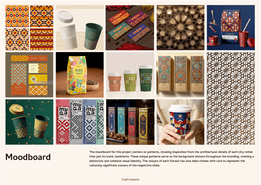
STRATEGIC APPROACH Instead of relying on overused travel clichés or generic city landmarks, the visual strategy was anchored in architectural geometry and local color stories. __ Architectural Textures: Designed bespoke repeating tile patterns directly inspired by structural motifs in each city, serving as the core textural foundation across all touchpoints. __ Flavor × Origin: Developed dedicated, culturally resonant color pairings for every destination blend to signal flavor notes visually. __ Connected Personalities: Developed each roast as part of a cohesive family, sharing a foundational grid while carrying its own vibrant character. __ Artisanal Contrast: Paired high-contrast display serif typography with clean sans-serif details to balance luxury craft with shelf legibility.


PACKAGING DESIGN: The Travel Collection The packaging was the primary objective for the "Cup Compass" brand identity, designed to transform a simple product into a collectible series. The Travel Collection was designed as something that customers would view as a gift for a loved one, or to remind themselves of the cities they've visited.
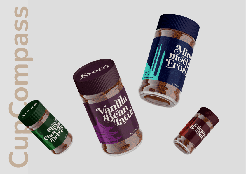
Instant Coffee Jars: These containers are designed for retail longevity, serving as the main visual anchor on store shelves.

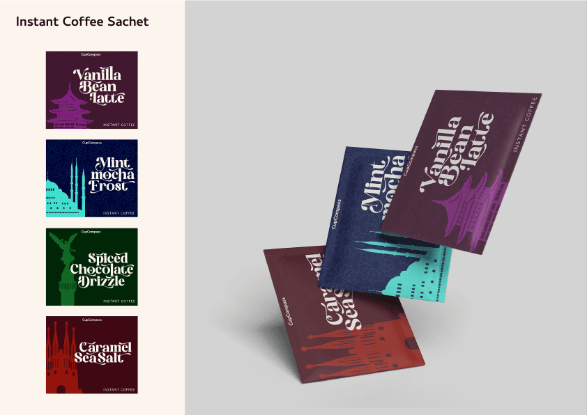
Instant Coffee Sachets: This is the most direct application of the "travel" concept, designed for individual sale and sampling.
3D PRODUCT DESIGN Designed specifically to appeal to the target audience of gift-givers seeking unique, practical presents. Unlike the jars, the mug provides a large, continuous surface to display the full city illustration and cultural patterns. This maximized visual appeal and reinforces the idea of holding a piece of travel culture.
SOCIAL MEDIA POSTS I designed a series of 5 social media posts, along with a brand launch video in an Instagram reel format for the marketing campaign. This helped the brand reach new audience, while also being able to templatise the posts for future use.
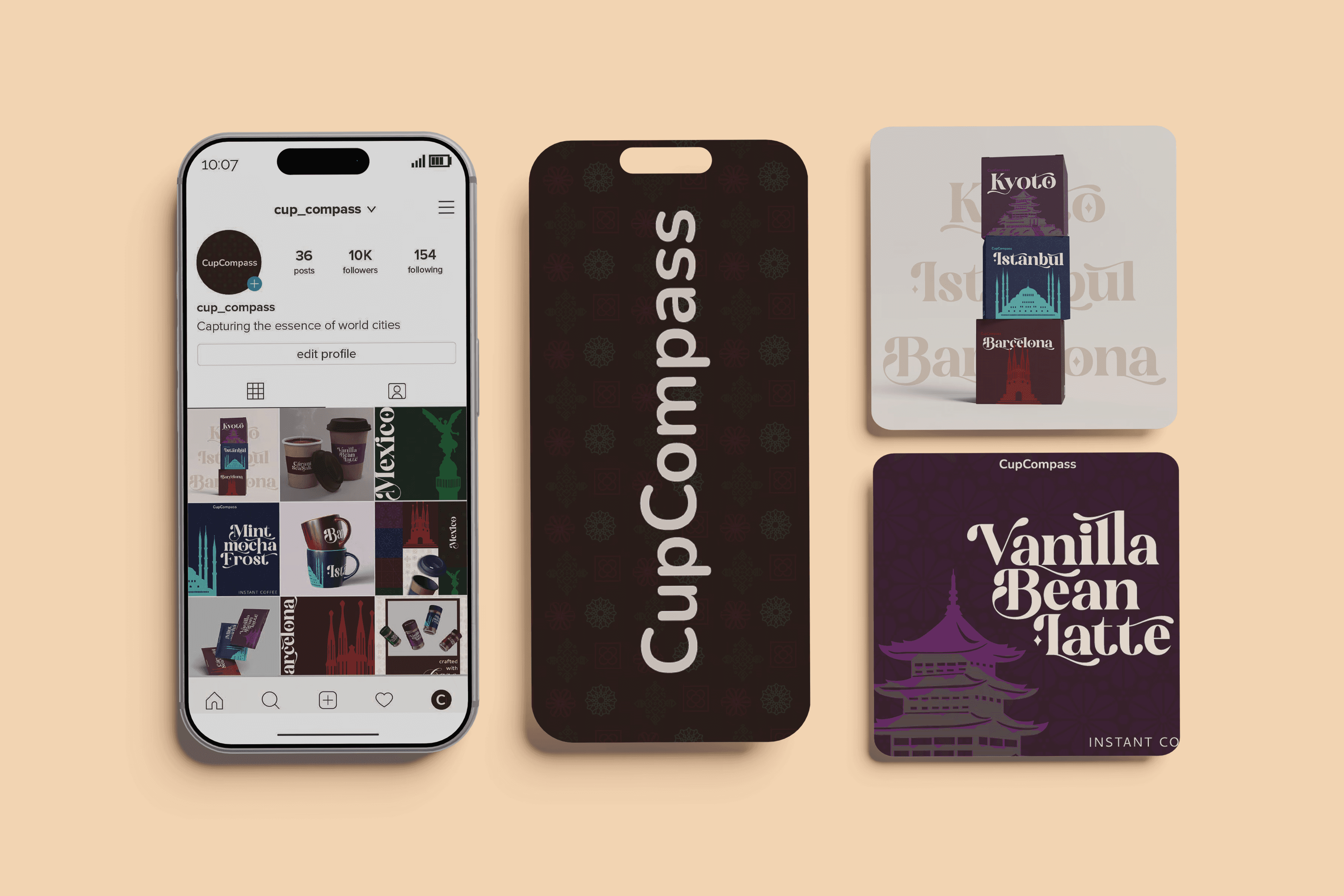


BRAND LAUNCH CAMPIGN For the Cup Compass brand launch video, I developed a dynamic animation that captures the brand’s essence of global exploration through coffee. The campaign highlights the unique city-inspired flavours, integrates architectural patterns from each location, and brings the brand’s vibrant visual identity to life with smooth motion graphics and playful typography. The final animation was produced in multiple formats to optimise for presentations and social media, ensuring consistent impact across platforms. I also designed some high-end mockups for CupCompass, that exude elegance and salutes the rich coffee culture celebrated across the world.
KEY IMPACT & OUTCOME __ Category Disruption: Shifted Cup Compass from a commodity coffee product into a premium, collectible lifestyle brand, creating instant differentiation on competitive retail shelves. __ Streamlined Product Expansion: The modular grid and architecture-inspired pattern system created an effortless framework for the business to launch future destination blends without redesigning the core packaging. __ Higher Perceived Value: High-contrast typography and rich physical mockups validated higher retail price points across jars and collectible gift box sets. __ Seamless Multi-Channel Launch: Cross-platform social assets generated strong brand awareness and engagement across feeds without requiring additional production resources.